 English
 Română
A Beginner's Guide to Fundamental Stock Analysis with Python and Pandas
A Beginner's Guide to Fundamental Stock Analysis with Python and Pandas
As many great stock market investors have taught us, before buying stocks in public companies we ought to take a closer look at a company's fundamentals and try to evaluate whether our investment is potentially risky or justified. But this is usually a tedious and boring process, unless you live and breathe economy-related numbers. Thankfully, software, mathematics and economics can intersect in interesting ways, allowing us to develop algorithms that automatically process information and generate useful results based on the criteria we define. This is exactly what we will attempt to do in this fundamentals analysis tutorial. We will pick a company and guide you through a set of valuation techniques that can help better understand the company's overall financial health.
For this tutorial we will take Apple company as an initial example and then we will use the same approach and analyze different companies. For this we will use Python, Pandas, Matplotlib and Jupyter, all available in the Financial Sandbox on Bytestark, and will run our analysis with it.
Exploring the dataset
For this tutorial we will assume that you are running the Financial and Statistical Sandbox on Bytestark, which comes with preloaded datasets that can be used for this analysis. Specifically, for this tutorial we will use the dataset fundamentals.csv from the data_sources/stocks folder.
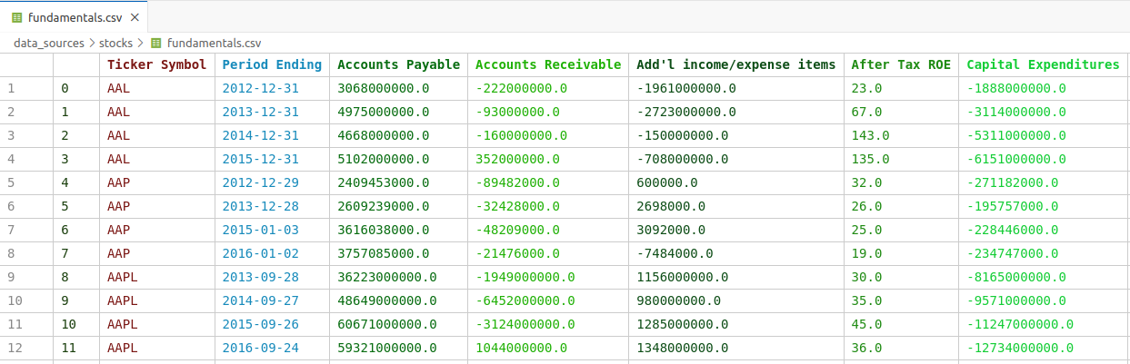
Let's explore the data we are working with. Opening the file in VSCode will automatically parse the CSV content and will render the table accordingly, which should be similar to the table below:
Loading the data
First thing we want to do is load the data into our Python script and then extract just the rows related to the selected company. We'll load the dataset into a top-level cell so that we don't re-run the same code again and again. We will import all the required libraries and create a top-level function named extract_company_data that will return just the data we need based on a ticker_symbol argument.
Add the following code into first code cell and execute it(Execute button or Shift + Enter).
import pandas as pd
import matplotlib.pyplot as plt
import numpy as np

fundamentals = pd.read_csv("data_sources/stocks/fundamentals.csv")
def extract_company_data(ticker_symbol):
    return fundamentals[fundamentals["Ticker Symbol"] == ticker_symbol ]
Revenue and Margins
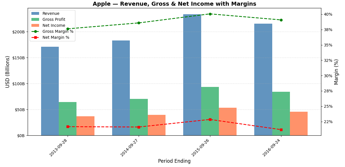
From investing standpoint revenue shows how fast a company is growing its business, but alone it doesn't tell you if the company is actually making money. Gross margin reveals how efficiently a company produces its goods — a consistently high or expanding gross margin signals a competitive advantage or pricing power. Net income and net margin show what's left after all expenses, taxes, and interest, reflecting the true profitability of the business. Tracking these metrics over time helps investors spot trends — like whether margins are expanding (a good sign) or being squeezed (a warning signal). Together, they paint a picture of whether a company is not just growing, but growing profitably and sustainably, which is ultimately what drives long-term shareholder value.
Let's add the code that will compute all the above financial indicators and plot them on the same graph for easier visualisation.
company = "AAPL" #### SELECT THE COMPANY ####
# Extract the information just for this company
company_data = extract_company_data(company)

financials = company_data[["Period Ending", "Total Revenue", "Gross Profit", "Net Income"]]

# Calculate margins
financials = financials.copy()
financials['Gross Margin'] = financials['Gross Profit'] / financials['Total Revenue'] * 100
financials['Net Margin'] = financials['Net Income'] / financials['Total Revenue'] * 100

# Create Plot
fig, ax1 = plt.subplots(figsize=(12, 6))

# Create bar chart for Revenue, Gross Profit, Net Income
width = 0.25
x = range(len(financials['Period Ending']))

ax1.bar([i - width for i in x], financials['Total Revenue'], width=width, label='Revenue',      color='steelblue',      alpha=0.85)
ax1.bar([i for i in x], financials['Gross Profit'],          width=width, label='Gross Profit', color='mediumseagreen', alpha=0.85)
ax1.bar([i + width for i in x], financials['Net Income'],    width=width, label='Net Income',   color='coral',          alpha=0.85)

# Set labels
ax1.set_ylabel('USD (Billions)', fontsize=12)
ax1.yaxis.set_major_formatter(plt.FuncFormatter(lambda x, _: f'${x/1e9:.0f}B'))
ax1.set_xticks(list(x))
ax1.set_xticklabels(financials['Period Ending'], rotation=45, ha='right')
ax1.set_xlabel('Period Ending', fontsize=12)

# Create second y-axis for margins
ax2 = ax1.twinx()
ax2.plot(list(x), financials['Gross Margin'], marker='o', color='green', linewidth=2, linestyle='--', label='Gross Margin %')
ax2.plot(list(x), financials['Net Margin'],   marker='s', color='red',   linewidth=2, linestyle='--', label='Net Margin %')
ax2.set_ylabel('Margin (%)', fontsize=12)
ax2.yaxis.set_major_formatter(plt.FuncFormatter(lambda y, _: f'{y:.0f}%'))

# Combine legends from both axes
lines1, labels1 = ax1.get_legend_handles_labels()
lines2, labels2 = ax2.get_legend_handles_labels()
ax1.legend(lines1 + lines2, labels1 + labels2, loc='upper left', fontsize=10)

ax1.set_title(f'{company} — Revenue, Gross & Net Income with Margins', fontsize=14, fontweight='bold')
ax1.grid(axis='y', linestyle='--', alpha=0.4)

plt.tight_layout()
plt.show()
Running the code above should generate the following graphs:
Assets vs Liabilities
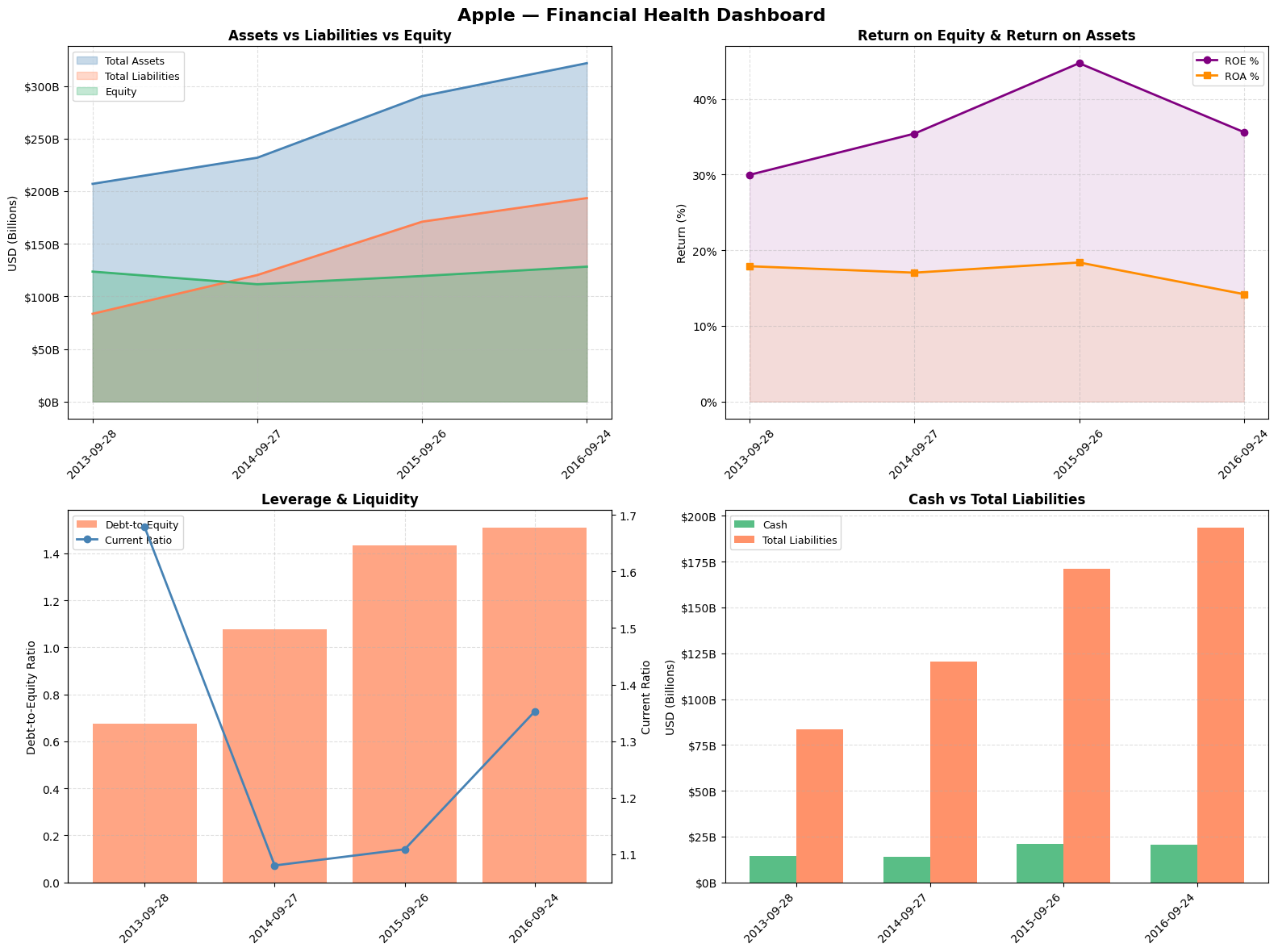
Assets vs Liabilities vs Equity This is the foundation of the balance sheet identity (Assets = Liabilities + Equity). Watching this over time tells you how a company finances its growth — ideally you want to see assets growing faster than liabilities, with equity expanding, meaning the company is building wealth for shareholders rather than just piling on debt.
Return on Equity (ROE) & Return on Assets (ROA) These are among the most watched metrics by professional investors like Warren Buffett. ROE tells you how much profit the company generates for every dollar shareholders have invested — a consistently high ROE signals a durable competitive advantage. ROA is more comprehensive as it accounts for debt too, showing how efficiently management deploys all resources at its disposal regardless of how the business is financed. A company with high ROE but low ROA may be artificially boosting returns through excessive borrowing, which is a red flag.
Debt-to-Equity & Current Ratio Debt-to-equity measures financial risk — a rising ratio means the company is increasingly relying on borrowed money, which amplifies both gains and losses and makes the business more vulnerable in downturns. The current ratio measures short-term liquidity, specifically whether the company has enough short-term assets to cover its near-term obligations. A current ratio below 1 can signal potential cash flow trouble, while a very high ratio might suggest the company is sitting on idle assets inefficiently.
Cash vs Total Liabilities This is a simple but powerful solvency check. A company drowning in liabilities relative to its cash position is vulnerable to financial distress, especially in rising interest rate environments. For investors, a strong and growing cash position relative to liabilities provides a margin of safety and signals that the company has the flexibility to invest, pay dividends, buy back shares, or weather economic storms without needing to raise capital at unfavorable terms.
company = "AAPL" #### SELECT THE COMPANY ####
# Extract the information just for this company
company_data = extract_company_data(company)

fig, axes = plt.subplots(2, 2, figsize=(16, 12))
fig.suptitle(f'{company} - Financial Health Dashboard', fontsize=16, fontweight='bold')

company_data['Debt to Equity']  = company_data['Total Liabilities'] / company_data['Total Equity']
company_data['ROE']             = company_data['Net Income'] / company_data['Total Equity'] * 100
company_data['ROA']             = company_data['Net Income'] / company_data['Total Assets'] * 100
company_data['Current Ratio']   = company_data['Total Current Assets'] / company_data['Total Current Liabilities']

x = company_data['Period Ending']

# Create Assets vs Liabilities vs Equity chart
# Numbers are in billions so they need to be normalized, therefore we divide by 10^9
ax1 = axes[0, 0]
ax1.fill_between(x, company_data['Total Assets']/1e9, alpha=0.3, color='steelblue', label='Total Assets')
ax1.fill_between(x, company_data['Total Liabilities']/1e9, alpha=0.3, color='coral', label='Total Liabilities')
ax1.fill_between(x, company_data['Total Equity']/1e9, alpha=0.3, color='mediumseagreen', label='Equity')
ax1.plot(x, company_data['Total Assets']/1e9, color='steelblue', linewidth=2)
ax1.plot(x, company_data['Total Liabilities']/1e9, color='coral', linewidth=2)
ax1.plot(x, company_data['Total Equity']/1e9, color='mediumseagreen', linewidth=2)

# Set labels
ax1.set_title('Assets vs Liabilities vs Equity', fontweight='bold')
ax1.set_ylabel('USD (Billions)')
ax1.yaxis.set_major_formatter(plt.FuncFormatter(lambda v, _: f'${v:.0f}B'))
ax1.legend(fontsize=9)
ax1.grid(linestyle='--', alpha=0.4)
ax1.tick_params(axis='x', rotation=45)

# Create Chart ROE and ROA
ax2 = axes[0, 1]
ax2.plot(x, company_data['ROE'], marker='o', color='purple', linewidth=2, label='ROE %')
ax2.plot(x, company_data['ROA'], marker='s', color='darkorange', linewidth=2, label='ROA %')
ax2.fill_between(x, company_data['ROE'], alpha=0.1, color='purple')
ax2.fill_between(x, company_data['ROA'], alpha=0.1, color='darkorange')

ax2.set_title('Return on Equity & Return on Assets', fontweight='bold')
ax2.set_ylabel('Return (%)')
ax2.yaxis.set_major_formatter(plt.FuncFormatter(lambda v, _: f'{v:.0f}%'))
ax2.legend(fontsize=9)
ax2.grid(linestyle='--', alpha=0.4)
ax2.tick_params(axis='x', rotation=45)

# Create Debt to Equity + Current Ratio (dual axis) chart
ax3 = axes[1, 0]
ax3b = ax3.twinx()
ax3.bar(x, company_data['Debt to Equity'], color='coral', alpha=0.7, label='Debt-to-Equity')
ax3b.plot(x, company_data['Current Ratio'], marker='o', color='steelblue', linewidth=2, label='Current Ratio')

ax3.set_title('Leverage & Liquidity', fontweight='bold')
ax3.set_ylabel('Debt-to-Equity Ratio')
ax3b.set_ylabel('Current Ratio')
lines1, labels1 = ax3.get_legend_handles_labels()
lines2, labels2 = ax3b.get_legend_handles_labels()
ax3.legend(lines1 + lines2, labels1 + labels2, fontsize=9)
ax3.grid(linestyle='--', alpha=0.4)
ax3.tick_params(axis='x', rotation=45)

# Create Cash vs Total Debt chart
ax4 = axes[1, 1]
width = 0.35
x_idx = range(len(x))
ax4.bar([i - width/2 for i in x_idx], company_data['Cash and Cash Equivalents']/1e9, width=width, color='mediumseagreen', alpha=0.85, label='Cash')
ax4.bar([i + width/2 for i in x_idx], company_data['Total Liabilities']/1e9, width=width, color='coral', alpha=0.85, label='Total Liabilities')

ax4.set_title('Cash vs Total Liabilities', fontweight='bold')
ax4.set_ylabel('USD (Billions)')
ax4.yaxis.set_major_formatter(plt.FuncFormatter(lambda v, _: f'${v:.0f}B'))
ax4.set_xticks(list(x_idx))
ax4.set_xticklabels(x, rotation=45, ha='right')
ax4.legend(fontsize=9)
ax4.grid(axis='y', linestyle='--', alpha=0.4)

plt.tight_layout()
plt.show()
Executing the code should result in following graphs:
Cash Flow
The Three Cash Flows
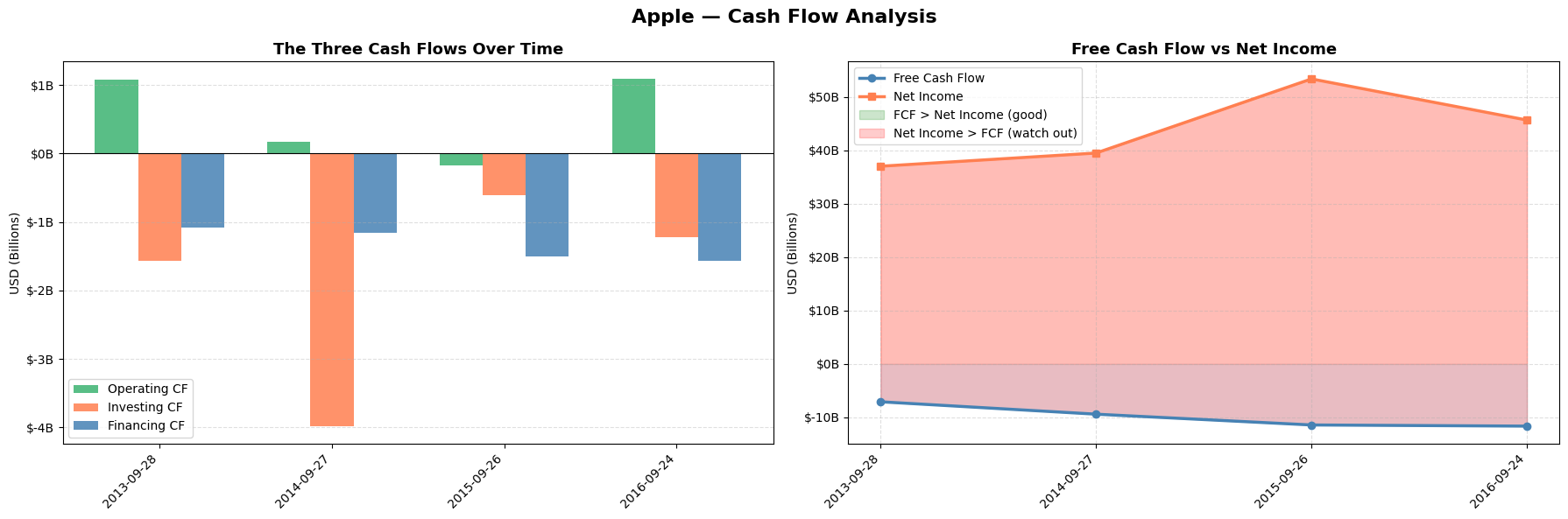
Understanding the three cash flows is critical because they reveal the true financial story behind the income statement. A company can report strong net income while simultaneously burning through cash, which is a major red flag. Operating cash flow shows whether the core business actually generates real money. Investing cash flow tells you whether management is reinvesting in future growth through capex, acquisitions, or R&D. Financing cash flow shows how the company funds itself — whether it's issuing debt, buying back shares, or paying dividends. Together they answer the fundamental question every investor should ask: where is the money actually coming from and where is it going?
Free Cash Flow vs Net Income
FCF is arguably the single most important metric in fundamental investing because it is much harder to manipulate than net income. Net income can be inflated through aggressive accounting choices — revenue recognition timing, depreciation schedules, one-time items — but cash is cash, it either hits the bank account or it doesn't. When FCF consistently exceeds net income it means the business is a cash generation machine, and that surplus cash can be reinvested, used to pay down debt, or returned to shareholders. When net income persistently exceeds FCF it raises serious questions about earnings quality and can be an early warning sign of financial stress or accounting manipulation. Many famous accounting scandals in history would have been spotted earlier by investors who paid close attention to the divergence between reported profits and free cash flow.
Let's add the code
company = "AAPL" #### SELECT THE COMPANY ####
# Extract the information just for this company
company_data = extract_company_data(company)

fig, axes = plt.subplots(1, 2, figsize=(18, 6))
fig.suptitle(f'{company} — Cash Flow Analysis', fontsize=16, fontweight='bold')

company_data['FCF'] = company_data['Other Operating Activities'] - abs(company_data['Capital Expenditures'])

x = company_data['Period Ending']
x_idx = range(len(x))
width = 0.25

# Create The Three Cash Flows chart
ax1 = axes[0]

ax1.bar([i - width for i in x_idx], company_data['Other Operating Activities']/1e9, width=width, color='mediumseagreen', alpha=0.85, label='Operating CF')
ax1.bar([i for i in x_idx], company_data['Other Investing Activities']/1e9, width=width, color='coral', alpha=0.85, label='Investing CF')
ax1.bar([i + width for i in x_idx], company_data['Other Financing Activities']/1e9, width=width, color='steelblue', alpha=0.85, label='Financing CF')

ax1.axhline(y=0, color='black', linewidth=0.8, linestyle='-')
ax1.set_title('The Three Cash Flows Over Time', fontsize=13, fontweight='bold')
ax1.set_ylabel('USD (Billions)')
ax1.yaxis.set_major_formatter(plt.FuncFormatter(lambda v, _: f'${v:.0f}B'))
ax1.set_xticks(list(x_idx))
ax1.set_xticklabels(x, rotation=45, ha='right')
ax1.legend(fontsize=10)
ax1.grid(axis='y', linestyle='--', alpha=0.4)

# Create FCF vs Net Income chart
ax2 = axes[1]

ax2.fill_between(x_idx, company_data['FCF']/1e9, alpha=0.15, color='steelblue')
ax2.fill_between(x_idx, company_data['Net Income']/1e9, alpha=0.15, color='coral')
ax2.plot(x_idx, company_data['FCF']/1e9, marker='o', color='steelblue', linewidth=2.5, label='Free Cash Flow')
ax2.plot(x_idx, company_data['Net Income']/1e9, marker='s', color='coral', linewidth=2.5, label='Net Income')

# Shade the gap between FCF and Net Income
ax2.fill_between(x_idx, company_data['FCF']/1e9, company_data['Net Income']/1e9, where=company_data['FCF']/1e9 >= company_data['Net Income']/1e9,
                 alpha=0.2, color='green', label='FCF > Net Income (good)'), ax2.fill_between(x_idx, company_data['FCF']/1e9, company_data['Net Income']/1e9,
                 where=company_data['FCF']/1e9 < company_data['Net Income']/1e9, alpha=0.2, color='red', label='Net Income > FCF (watch out)')

ax2.set_title('Free Cash Flow vs Net Income', fontsize=13, fontweight='bold')
ax2.set_ylabel('USD (Billions)')
ax2.yaxis.set_major_formatter(plt.FuncFormatter(lambda v, _: f'${v:.0f}B'))
ax2.set_xticks(list(x_idx))
ax2.set_xticklabels(x, rotation=45, ha='right')
ax2.legend(fontsize=10)
ax2.grid(linestyle='--', alpha=0.4)

plt.tight_layout()
plt.show()
The cash flow graph should be similar to the following image:
Competition Analysis
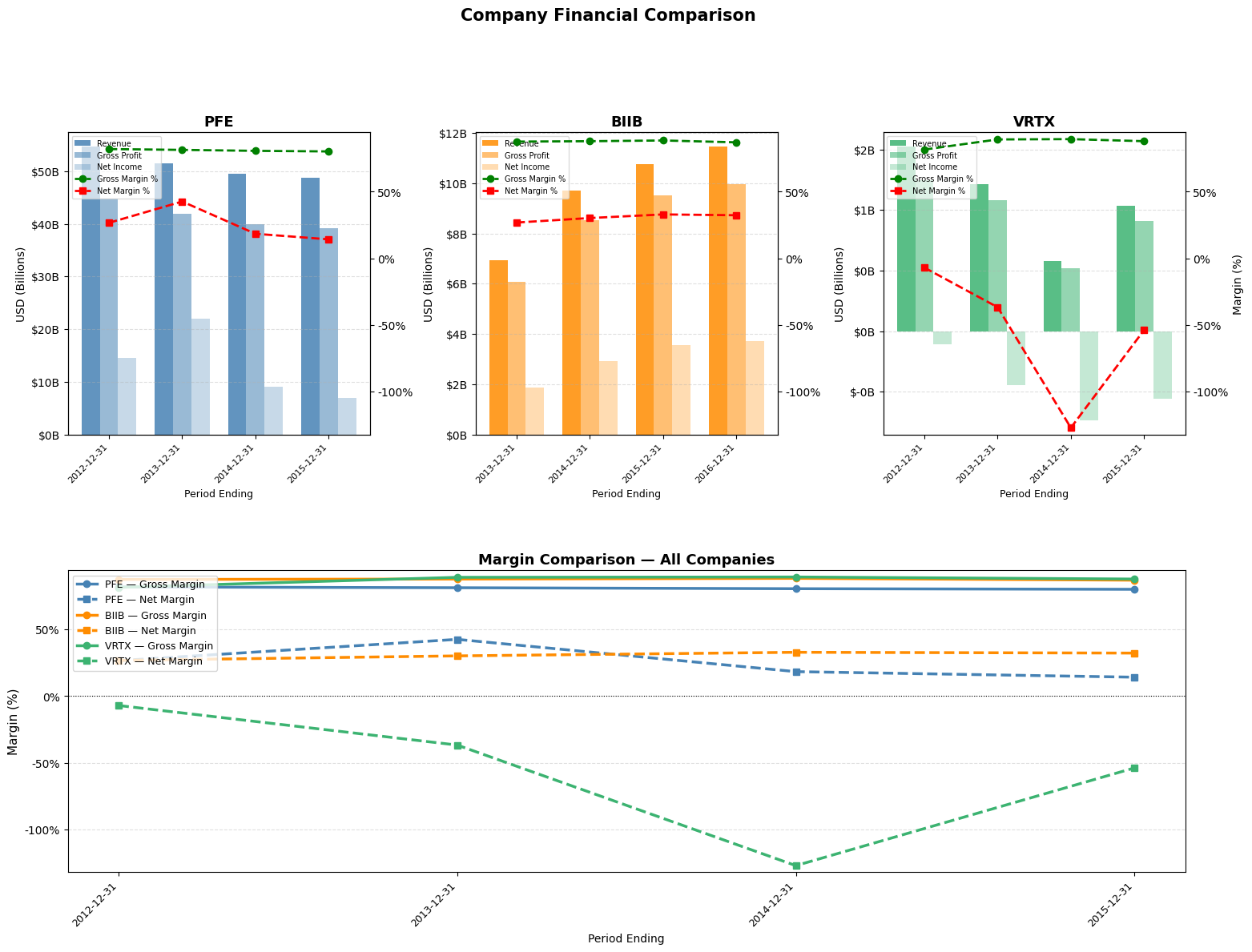
Understanding a company's true performance requires more than just looking at its numbers in isolation. Revenue growth and profitability can appear strong on the surface, yet tell a very different story once placed alongside those of direct competitors. Margin analysis — comparing gross, operating, and net margins across companies in the same industry — cuts through that noise. Because companies in the same sector face similar cost structures, pricing environments, and economic cycles, differences in margins are unlikely to be explained by external factors. Instead, they point directly at internal ones: how efficiently a company manages its costs, how much pricing power it holds over customers, how well it scales, and ultimately how durable its competitive position is. A company consistently maintaining higher gross margins than its peers, for instance, is likely benefiting from a structural advantage — better supplier relationships, a premium brand, or a more efficient production process. A persistently lower net margin, on the other hand, may signal excessive debt, bloated overhead, or a business model under pressure that top-line growth alone can mask. This is why competitor margin benchmarking is one of the first tools analysts reach for: it transforms raw financials into a relative story, revealing not just how a company is doing, but how well it is doing compared to those fighting for the same customers.
# SELECT 2 or 3 COMPANIES
companies = ["PFE", "BIIB", "VRTX"]

# Function to extract & compute margins
def get_margins(company):
    data = extract_company_data(company)
    df = data[["Period Ending", "Total Revenue", "Gross Profit", "Net Income"]].copy()
    df["Gross Margin"] = df["Gross Profit"] / df["Total Revenue"] * 100
    df["Net Margin"]   = df["Net Income"]   / df["Total Revenue"] * 100
    return df

# Build a dict of dataframes
company_dfs = {c: get_margins(c) for c in companies}

# Set colors for companies
PALETTE = ["steelblue", "darkorange", "mediumseagreen"]
company_colors = {c: PALETTE[i] for i, c in enumerate(companies)}

n = len(companies)

# FIGURE LAYOUT
# Top row  : one subplot per company (bars + margin lines)
# Bottom   : single overlay for direct margin comparison
fig = plt.figure(figsize=(6 * n, 12))
gs  = gridspec.GridSpec(2, n, figure=fig, hspace=0.45, wspace=0.35)

# Global margin y-limits so subplots share the same scale
all_gross = np.concatenate([df["Gross Margin"].values for df in company_dfs.values()])
all_net   = np.concatenate([df["Net Margin"].values   for df in company_dfs.values()])
margin_min = min(all_net.min(),   0) - 5
margin_max = max(all_gross.max(), 0) + 5

# TOP ROW — per-company bar + margin chart
for col, company in enumerate(companies):
    df    = company_dfs[company]
    color = company_colors[company]
    x     = range(len(df["Period Ending"]))
    width = 0.25

    ax1 = fig.add_subplot(gs[0, col])

    ax1.bar([i - width for i in x], df["Total Revenue"], width=width, label="Revenue",      color=color, alpha=0.85)
    ax1.bar([i for i in x], df["Gross Profit"],          width=width, label="Gross Profit", color=color, alpha=0.55)
    ax1.bar([i + width  for i in x], df["Net Income"],   width=width, label="Net Income",   color=color, alpha=0.30)

    ax1.set_ylabel("USD (Billions)", fontsize=10)
    ax1.yaxis.set_major_formatter(plt.FuncFormatter(lambda v, _: f"${v/1e9:.0f}B"))
    ax1.set_xticks(list(x))
    ax1.set_xticklabels(df["Period Ending"], rotation=45, ha="right", fontsize=8)
    ax1.set_xlabel("Period Ending", fontsize=9)
    ax1.set_title(f"{company}", fontsize=13, fontweight="bold")
    ax1.grid(axis="y", linestyle="--", alpha=0.4)

    ax2 = ax1.twinx()
    ax2.plot(list(x), df["Gross Margin"], marker="o", color="green", linewidth=2, linestyle="--", label="Gross Margin %")
    ax2.plot(list(x), df["Net Margin"],   marker="s", color="red",   linewidth=2, linestyle="--", label="Net Margin %")
    # Combine scales
    ax2.set_ylim(margin_min, margin_max)
    ax2.set_ylabel("Margin (%)", fontsize=10)
    ax2.yaxis.set_major_formatter(plt.FuncFormatter(lambda v, _: f"{v:.0f}%"))

    # hide right margin axis on non-last subplots to reduce clutter
    if col < n - 1:
        ax2.set_ylabel("")

    lines1, labels1 = ax1.get_legend_handles_labels()
    lines2, labels2 = ax2.get_legend_handles_labels()
    ax1.legend(lines1 + lines2, labels1 + labels2,
               loc="upper left", fontsize=7, framealpha=0.7)

# BOTTOM ROW — direct margin comparison overlay
ax_overlay = fig.add_subplot(gs[1, :])   # spans all columns

for company in companies:
    df    = company_dfs[company]
    color = company_colors[company]
    x     = range(len(df["Period Ending"]))

    ax_overlay.plot(list(x), df["Gross Margin"], marker="o", color=color, linewidth=2.5, linestyle="-",  label=f"{company} — Gross Margin")
    ax_overlay.plot(list(x), df["Net Margin"],   marker="s", color=color, linewidth=2.5, linestyle="--", label=f"{company} — Net Margin")

# Use x-labels from first company (assumes same periods; adjust if needed)
ref_df = company_dfs[companies[0]]
ax_overlay.set_xticks(list(range(len(ref_df["Period Ending"]))))
ax_overlay.set_xticklabels(ref_df["Period Ending"], rotation=45, ha="right", fontsize=9)
ax_overlay.set_ylim(margin_min, margin_max)
ax_overlay.set_ylabel("Margin (%)", fontsize=11)
ax_overlay.set_xlabel("Period Ending", fontsize=10)
ax_overlay.yaxis.set_major_formatter(plt.FuncFormatter(lambda v, _: f"{v:.0f}%"))
ax_overlay.set_title("Margin Comparison — All Companies", fontsize=13, fontweight="bold")
ax_overlay.legend(fontsize=9, loc="upper left", framealpha=0.8)
ax_overlay.grid(axis="y", linestyle="--", alpha=0.4)
ax_overlay.axhline(0, color="black", linewidth=0.8, linestyle=":")

plt.suptitle("Company Financial Comparison", fontsize=15, fontweight="bold", y=1.01)
plt.tight_layout()
plt.savefig("multi_company_margins.png", dpi=150, bbox_inches="tight")
plt.show()
Executing the code above should generate 1 revenue and margins graph per company(depends on how many were selected) and place them side-to-side and 1 combined graph that plots just the margins to highlight the differences for different companies. The graph should look like the one below:
Summary
In the world of investing, there are countless techniques to analyze companies, and in this tutorial we explored just a couple of basic ones to get a better understanding of how it works and what we can achieve when, instead of simply reading the data, we process it in useful ways and display it for our convenience. My hope is that this tutorial sparked your interest in quantitative company analysis using Python, and that you are now equipped with the proper knowledge and tools to continue exploring more complex analysis techniques on your own - and perhaps improve the code presented here, use it on more recent data, and analyze a larger time period.