 English
 Română
Exploring Gold Price Trends with Python: A Pandas and Matplotlib Tutorial
Exploring Gold Price Trends with Python: A Pandas and Matplotlib Tutorial
Introduction
Python has become the go-to language for data analysis and visualization, and some of the most popular and powerful libraries are Pandas and Matplotlib.
Pandas provides robust data manipulation capabilities and Matplotlib allows you to create visualizations to better understand your data. Together, these libraries form a powerful toolkit for statistical analysis.
In this tutorial, we'll explore historical gold prices using real-world data to learn how to load, clean, filter, and visualize time-series data. Gold prices are particularly interesting because they reflect economic conditions, inflation trends, and global market sentiment. By analyzing this data, you'll learn practical techniques that you can apply to any time-series dataset, be it stock prices or weather patterns.
For this tutorial, we will make a couple assumptions so that we can provide exact commands and file paths:
- You are running Financial & Statistical Sandbox available on Bytestark.com
- You are using the provided gold price data file available at data_sources/gold_prices.csv
- Your starting folder when you open the Financial & Statistical Sandbox is /home/coder/learning. When paths are referenced, they will be relative to this root path.
Understanding the Dataset and Libraries
Before we dive into coding, let's understand the libraries we'll be using:
Pandas is a data manipulation library that provides data structures like DataFrames and powerful tools for reading, filtering, and transforming data.
Matplotlib is the foundational plotting library in Python. It gives you total control over your graphs, from axes to colors to labels.
Seaborn is built on top of Matplotlib and provides a higher-level interface for creating attractive statistical graphics with less code. We'll use it to enhance the styling of our plots.
Our dataset contains historical gold prices with dates and corresponding gold values.
The dates are in DD/MM/YYYY format, and we'll need to convert them to proper datetime objects so
Python can work with them effectively.
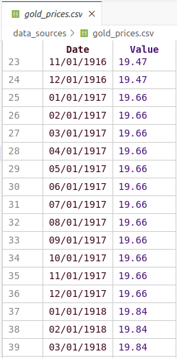
The data is presented in the following format:
Loading and Inspecting the Data
Let's start by creating a Python script to load and examine our gold price data.
Create a new file called gold_analysis.py and add the following code:
import pandas as pd
import seaborn as sns
import matplotlib.pyplot as plt
from datetime import datetime
import matplotlib.dates as mdates

# Load the gold price data
result = pd.read_csv("data_sources/gold_prices.csv")

# Display the first few rows to understand the structure
print("First 5 rows of the dataset:")
print(result.head())

# Check the data types
print("\nData types:")
print(result.dtypes)

# Get basic statistics
print("\nBasic statistics:")
print(result.describe())
What this code does:
- We import all the necessary libraries at the top
pd.read_csv()loads the CSV file into a Pandas DataFrame, which is the primary data structure we'll work withhead()shows us the first 5 rows of datadtypesreveals the data type of each columndescribe()provides summary statistics like mean, median and standard deviation
To run the script use the following command:
python3 gold_analysis.py
The result should be similar to the one below:
First 5 rows of the dataset:
         Date  Value
0  01/01/1915  19.25
1  02/01/1915  19.25
2  03/01/1915  19.25
3  04/01/1915  19.25
4  05/01/1915  19.25

Data types:
Date      object
Value    float64
dtype: object

Basic statistics:
             Value
count  1333.000000
mean    387.771207
std     618.579873
min      19.250000
25%      35.000000
50%      40.800000
75%     400.000000
max    5296.834900
You may notice that the "Date" column is an 'object' type rather than a datetime type. We need to convert it so that it's easier to work with.
Converting Date Strings to Datetime Objects
Working with dates as strings is problematic because Python won't understand chronological ordering
or allow us to filter by year, month, or day. We need to convert the date strings into proper datetime
objects. Change the code in gold_analysis.py by pasting the following instead:
import pandas as pd
import seaborn as sns
import matplotlib.pyplot as plt
from datetime import datetime
import matplotlib.dates as mdates

# Load the gold price data
result = pd.read_csv("data_sources/gold_prices.csv")

# Convert the Date column from string to datetime objects
result["Date"] = result["Date"].apply(lambda x: datetime.strptime(x, "%d/%m/%Y"))

# Verify the conversion
print("Data types after conversion:")
print(result.dtypes)
print("\nFirst 5 rows after conversion:")
print(result.head())

# Check the date range in our dataset
print(f"\nDate range: {result['Date'].min()} to {result['Date'].max()}")
Executing the script will result in the following output:
Data types after conversion:
Date     datetime64[ns]
Value           float64
dtype: object

First 5 rows after conversion:
        Date  Value
0 1915-01-01  19.25
1 1915-01-02  19.25
2 1915-01-03  19.25
3 1915-01-04  19.25
4 1915-01-05  19.25

Date range: 1915-01-01 00:00:00 to 2026-01-01 00:00:00
Let's understand the date conversion:
apply()applies a function to every value in the "Date" columnlambda x:creates an anonymous function that takes each date string as inputdatetime.strptime(x, "%d/%m/%Y")parses the string according to the format pattern:%d= day (01-31)%m= month (01-12)%Y= four-digit year (e.g., 2024)
- After conversion, the "Date" column will show as
datetime64[ns]type instead ofobject
Filtering Data by Date Range
Now that we have proper datetime objects, we can easily filter our data to focus on a specific time period. Often when analyzing trends, you want to focus on recent years or a specific period of interest. Let's filter our data to only include years from 2000 to 2026:
import pandas as pd
import seaborn as sns
import matplotlib.pyplot as plt
from datetime import datetime
import matplotlib.dates as mdates

# Load and convert the data
result = pd.read_csv("data_sources/gold_prices.csv")
result["Date"] = result["Date"].apply(lambda x: datetime.strptime(x, "%d/%m/%Y"))

# Filter data for years 2000-2026
data = result[(result["Date"].dt.year >= 2000) & (result["Date"].dt.year <= 2026)]

print(f"Original dataset size: {len(result)} rows")
print(f"Filtered dataset size: {len(data)} rows")
print(f"\nFiltered date range: {data['Date'].min()} to {data['Date'].max()}")
print(f"\nPrice range: ${data['Value'].min():.2f} to ${data['Value'].max():.2f}")
Running the code will result in:
Original dataset size: 1333 rows
Filtered dataset size: 313 rows

Filtered date range: 2000-01-01 00:00:00 to 2026-01-01 00:00:00

Price range: $259.05 to $5296.83
Let's go over the changes:
result["Date"].dt.yearaccesses the year component of each datetime object>= 2000and<= 2026create boolean conditions for the year range&combines both conditions (both must be True)- The square brackets
[]apply this filter to create a new DataFrame calleddata - We use
len()to compare the original and filtered dataset sizes
Note: The .dt attribute is crucial here as it provides access to datetime properties like .year, .month, .day, .dayofweek, etc.
Without it, we'll get an error when trying to access these properties.
Creating First Visualization
Processing data is just half of the job, when we have processed it we need to see it to understand it better.
A line plot is perfect for time-series data like gold prices because it shows trends over time.
Let's create a basic plot:
import pandas as pd
import seaborn as sns
import matplotlib.pyplot as plt
from datetime import datetime
import matplotlib.dates as mdates
# Load, convert, and filter the data
result = pd.read_csv("data_sources/gold_prices.csv")
result["Date"] = result["Date"].apply(lambda x: datetime.strptime(x, "%d/%m/%Y"))
data = result[(result["Date"].dt.year >= 2000) & (result["Date"].dt.year <= 2026)]
# Create the plot
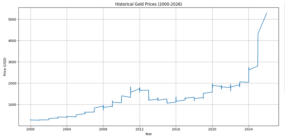
plt.figure(figsize=(12, 6))
plt.plot(data["Date"], data["Value"])
plt.xlabel("Year")
plt.ylabel("Price (USD)")
plt.title("Historical Gold Prices (2000-2026)")
plt.grid(True)
plt.tight_layout()
plt.show()
If the notebook was created and configured successfully the following graph should appear:
Here's what each plotting command does:
plt.figure(figsize=(12, 6))creates a new figure with width=12 inches and height=6 inchesplt.plot(data["Date"], data["Value"])creates a line plot with dates on x-axis and prices on y-axisplt.xlabel()andplt.ylabel()add descriptive labels to the axesplt.title()adds a title to help viewers understand what they're seeingplt.grid(True)adds a grid to make it easier to read valuesplt.tight_layout()automatically adjusts spacing to prevent labels from being cut offplt.show()displays the plot (or saves it if you're not in an interactive environment)
Improving Date Formatting on the X-Axis
You might notice that the x-axis dates look crowded or poorly formatted.
Let's improve this by formatting the dates to show only years and
rotating the labels for better readability.
Note - In Jupyter you don't have to replace the existing code, you can just use a different cell and execute just
that cell using the same Shift + Enter. This is one of the features that makes Jupyter so convenient for data analysis.
import pandas as pd
import seaborn as sns
import matplotlib.pyplot as plt
from datetime import datetime
import matplotlib.dates as mdates

# Load, convert, and filter the data
result = pd.read_csv("data_sources/gold_prices.csv")
result["Date"] = result["Date"].apply(lambda x: datetime.strptime(x, "%d/%m/%Y"))
data = result[(result["Date"].dt.year >= 2000) & (result["Date"].dt.year <= 2026)]

# Create the plot with improved date formatting
plt.figure(figsize=(12, 6))
plt.plot(data["Date"], data["Value"], linewidth=2, color='#FFD700')
plt.xlabel("Year", fontsize=12)
plt.ylabel("Price (USD)", fontsize=12)
plt.title("Historical Gold Prices (2000-2026)", fontsize=14, fontweight='bold')

# Format x-axis to show years
plt.gca().xaxis.set_major_locator(mdates.YearLocator())
plt.gca().xaxis.set_major_formatter(mdates.DateFormatter("%Y"))
plt.xticks(rotation=45)

plt.grid(True, alpha=0.3)
plt.tight_layout()
plt.show()
The updated graph should be similar to the one below:
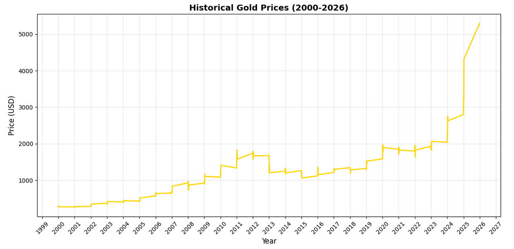
Let's understand the date formatting improvements:
plt.gca()gets the current axes object, giving us access to more advanced formatting optionsxaxis.set_major_locator(mdates.YearLocator())places tick marks at yearly intervalsxaxis.set_major_formatter(mdates.DateFormatter("%Y"))formats those ticks to show only the yearplt.xticks(rotation=45)rotates the date labels 45 degrees to prevent overlap- We've also added
linewidth=2to make the line more visible andcolor='#FFD700'(gold color) for thematic consistency alpha=0.3makes the grid lines semi-transparent so they don't dominate the visualization
Adding Statistical Analysis
Combining graphical visualization with statistical analysis provides more powerful and deeper insights.
Let's calculate some key statistics and add them to our visualization:
import pandas as pd
import seaborn as sns
import matplotlib.pyplot as plt
from datetime import datetime
import matplotlib.dates as mdates

# Load, convert, and filter the data
result = pd.read_csv("data_sources/gold_prices.csv")
result["Date"] = result["Date"].apply(lambda x: datetime.strptime(x, "%d/%m/%Y"))
data = result[(result["Date"].dt.year >= 2000) & (result["Date"].dt.year <= 2026)]

# Calculate statistics
mean_price = data["Value"].mean()
median_price = data["Value"].median()
std_price = data["Value"].std()
min_price = data["Value"].min()
max_price = data["Value"].max()

# Find the dates of min and max prices
min_date = data.loc[data["Value"].idxmin(), "Date"]
max_date = data.loc[data["Value"].idxmax(), "Date"]

# Create the plot
plt.figure(figsize=(14, 7))
plt.plot(data["Date"], data["Value"], linewidth=2, color='#FFD700', label='Gold Price')

# Add horizontal lines for mean and median
plt.axhline(y=mean_price, color='red', linestyle='--', linewidth=1.5, label=f'Mean: ${mean_price:.2f}')
plt.axhline(y=median_price, color='blue', linestyle='--', linewidth=1.5, label=f'Median: ${median_price:.2f}')

plt.xlabel("Year", fontsize=12)
plt.ylabel("Price (USD)", fontsize=12)
plt.title("Historical Gold Prices with Statistical Analysis (2000-2026)", fontsize=14, fontweight='bold')

# Format x-axis
plt.gca().xaxis.set_major_locator(mdates.YearLocator())
plt.gca().xaxis.set_major_formatter(mdates.DateFormatter("%Y"))
plt.xticks(rotation=45)

plt.grid(True, alpha=0.3)
plt.legend(loc='upper left')
plt.tight_layout()
plt.show()

# Print statistics
print("=" * 50)
print("GOLD PRICE STATISTICS (2000-2026)")
print("=" * 50)
print(f"Mean Price:           ${mean_price:.2f}")
print(f"Median Price:         ${median_price:.2f}")
print(f"Standard Deviation:   ${std_price:.2f}")
print(f"Minimum Price:        ${min_price:.2f} on {min_date.strftime('%Y-%m-%d')}")
print(f"Maximum Price:        ${max_price:.2f} on {max_date.strftime('%Y-%m-%d')}")
print(f"Price Range:          ${max_price - min_price:.2f}")
print("=" * 50)
Let's take a look at the result:
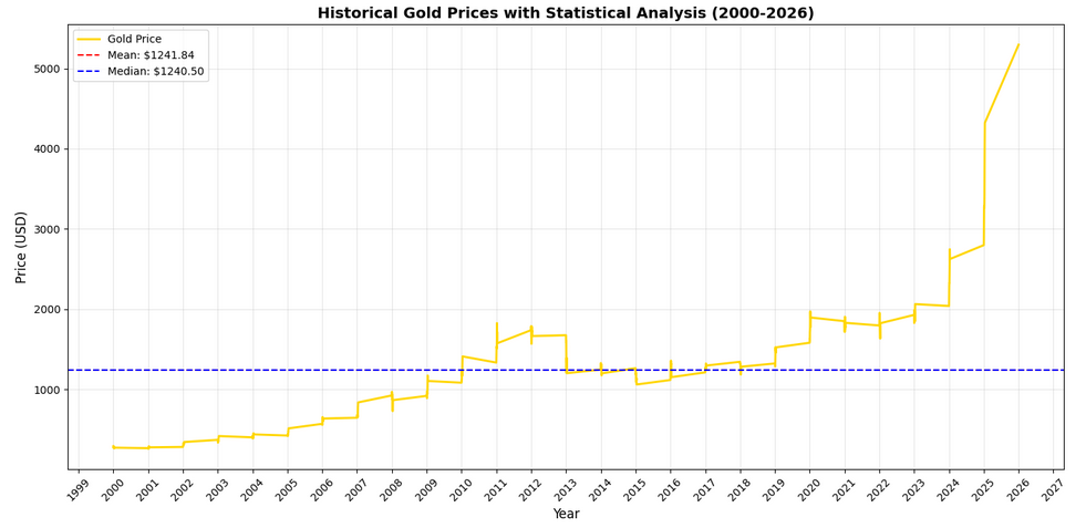
And also break down the statistical calculations:
mean()calculates the average price across all data pointsmedian()finds the middle value when all prices are sortedstd()measures the standard deviation, showing how spread out the prices areidxmin()andidxmax()find the index positions of minimum and maximum valuesloc[]retrieves the actual date values at those index positionsaxhline()draws horizontal reference lines on the plotlegend()adds a legend box explaining what each line represents
The standard deviation is particularly useful metric. A high standard deviation means gold prices were volatile, while a low one means they were relatively stable.
Creating a Multi-Panel Analysis
For more comprehensive analysis, let's create a figure with multiple subplots showing different aspects of the data. This gives us a dashboard-like view of the gold prices:
import pandas as pd
import seaborn as sns
import matplotlib.pyplot as plt
from datetime import datetime
import matplotlib.dates as mdates

# Load, convert, and filter the data
result = pd.read_csv("data_sources/gold_prices.csv")
result["Date"] = result["Date"].apply(lambda x: datetime.strptime(x, "%d/%m/%Y"))
data = result[(result["Date"].dt.year >= 2000) & (result["Date"].dt.year <= 2026)]

# Create a figure with multiple subplots
fig, axes = plt.subplots(2, 2, figsize=(16, 10))
fig.suptitle('Comprehensive Gold Price Analysis (2000-2026)', fontsize=16, fontweight='bold')

# Subplot 1: Time series with trend
axes[0, 0].plot(data["Date"], data["Value"], linewidth=1.5, color='#FFD700', alpha=0.7)
axes[0, 0].plot(data["Date"], data["Value"].rolling(window=30).mean(),
                linewidth=2, color='darkred', label='30-Day Moving Average')
axes[0, 0].set_xlabel("Year")
axes[0, 0].set_ylabel("Price (USD)")
axes[0, 0].set_title("Price Trend with Moving Average")
axes[0, 0].legend()
axes[0, 0].grid(True, alpha=0.3)

# Subplot 2: Distribution histogram
axes[0, 1].hist(data["Value"], bins=50, color='#FFD700', edgecolor='black', alpha=0.7)
axes[0, 1].axvline(data["Value"].mean(), color='red', linestyle='--', linewidth=2, label='Mean')
axes[0, 1].axvline(data["Value"].median(), color='blue', linestyle='--', linewidth=2, label='Median')
axes[0, 1].set_xlabel("Price (USD)")
axes[0, 1].set_ylabel("Frequency")
axes[0, 1].set_title("Price Distribution")
axes[0, 1].legend()
axes[0, 1].grid(True, alpha=0.3)

# Subplot 3: Year-over-year change
data['Year'] = data['Date'].dt.year
yearly_avg = data.groupby('Year')['Value'].mean()
axes[1, 0].bar(yearly_avg.index, yearly_avg.values, color='#FFD700', edgecolor='black', alpha=0.7)
axes[1, 0].set_xlabel("Year")
axes[1, 0].set_ylabel("Average Price (USD)")
axes[1, 0].set_title("Average Annual Gold Price")
axes[1, 0].grid(True, alpha=0.3, axis='y')
plt.setp(axes[1, 0].xaxis.get_majorticklabels(), rotation=45)

# Subplot 4: Box plot by year (last 10 years for clarity)
recent_data = data[data['Year'] >= 2016]
years = sorted(recent_data['Year'].unique())
box_data = [recent_data[recent_data['Year'] == year]['Value'].values for year in years]
axes[1, 1].boxplot(box_data, labels=years)
axes[1, 1].set_xlabel("Year")
axes[1, 1].set_ylabel("Price (USD)")
axes[1, 1].set_title("Price Distribution by Year (2016-2026)")
axes[1, 1].grid(True, alpha=0.3, axis='y')

plt.tight_layout()
plt.show()
Running this code will generate the following graph:
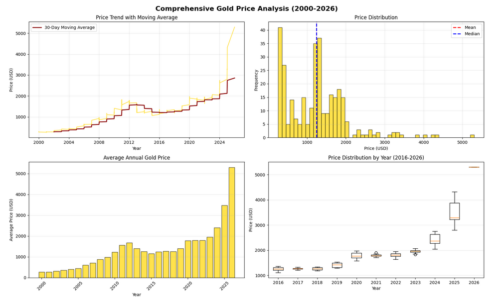
This multi-panel visualization provides four different perspectives:
- Top-left: Time series with a 30-day moving average to smooth out daily fluctuations and reveal the underlying trend
- Top-right: Histogram showing the distribution of prices, helping us see if prices cluster around certain values
- Bottom-left: Bar chart of average annual prices, making year-to-year comparisons easy
- Bottom-right: Box plots showing the spread and quartiles of prices for recent years
Key functions explained:
plt.subplots(2, 2)creates a 2×2 grid of subplotsrolling(window=30).mean()calculates a moving average over 30 data pointshist()creates a histogram with 50 binsgroupby('Year')['Value'].mean()groups data by year and calculates the mean for each groupboxplot()shows the median, quartiles, and outliers for each year
Calculating and Visualizing Returns
In financial analysis, we often want to see not just prices but returns—the percentage change from one period to another. Let's calculate daily returns and visualize them:
import pandas as pd
import seaborn as sns
import matplotlib.pyplot as plt
from datetime import datetime
import matplotlib.dates as mdates

# Load, convert, and filter the data
result = pd.read_csv("data_sources/gold_prices.csv")
result["Date"] = result["Date"].apply(lambda x: datetime.strptime(x, "%d/%m/%Y"))
data = result[(result["Date"].dt.year >= 2000) & (result["Date"].dt.year <= 2026)].copy()

# Calculate daily returns (percentage change)
data['Daily_Return'] = data['Value'].pct_change() * 100

# Calculate cumulative returns
data['Cumulative_Return'] = ((1 + data['Value'].pct_change()).cumprod() - 1) * 100

# Create visualization
fig, axes = plt.subplots(2, 1, figsize=(14, 10))
fig.suptitle('Gold Price Returns Analysis', fontsize=16, fontweight='bold')

# Daily returns
axes[0].plot(data["Date"], data["Daily_Return"], linewidth=0.5, color='#FFD700', alpha=0.6)
axes[0].axhline(y=0, color='black', linestyle='-', linewidth=1)
axes[0].fill_between(data["Date"], data["Daily_Return"], 0,
                      where=(data["Daily_Return"] > 0), color='green', alpha=0.3, label='Positive Returns')
axes[0].fill_between(data["Date"], data["Daily_Return"], 0,
                      where=(data["Daily_Return"] <= 0), color='red', alpha=0.3, label='Negative Returns')
axes[0].set_ylabel("Daily Return (%)")
axes[0].set_title("Daily Returns Over Time")
axes[0].legend()
axes[0].grid(True, alpha=0.3)

# Cumulative returns
axes[1].plot(data["Date"], data["Cumulative_Return"], linewidth=2, color='darkgreen')
axes[1].fill_between(data["Date"], data["Cumulative_Return"], 0, alpha=0.3, color='lightgreen')
axes[1].set_xlabel("Year")
axes[1].set_ylabel("Cumulative Return (%)")
axes[1].set_title("Cumulative Returns Since 2000")
axes[1].grid(True, alpha=0.3)

plt.tight_layout()
plt.show()

# Print return statistics
print("\n" + "=" * 50)
print("RETURN STATISTICS")
print("=" * 50)
print(f"Average Daily Return:    {data['Daily_Return'].mean():.4f}%")
print(f"Daily Return Std Dev:    {data['Daily_Return'].std():.4f}%")
print(f"Best Daily Return:       {data['Daily_Return'].max():.4f}%")
print(f"Worst Daily Return:      {data['Daily_Return'].min():.4f}%")
print(f"Total Cumulative Return: {data['Cumulative_Return'].iloc[-1]:.2f}%")
print("=" * 50)
After running the code above we should see the following graph:
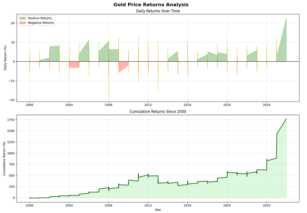
Understanding returns calculations:
pct_change()calculates the percentage change from the previous value* 100converts decimal returns to percentages (e.g., 0.05 becomes 5%)cumprod()calculates the cumulative product, giving us cumulative returnsfill_between()colors the area between the line and zero, with different colors for positive and negative returnswhere=parameter specifies a condition for when to apply each color
Note: The .copy() after filtering is important—it creates a copy of the DataFrame so we can safely add new columns without triggering warnings about modifying a slice of the original data.
Best Practices and Performance Considerations
When working with Pandas and Matplotlib for data analysis, following these best practices will help you create more efficient and maintainable code:
1. Load Data Once
Always load your data once at the beginning of your script and reuse that DataFrame. Reading CSV files repeatedly is slow and unnecessary. If you're working with very large datasets, consider using pd.read_csv() with the usecols parameter to load only the columns you need.
2. Use Vectorized Operations
Pandas operations like apply(), pct_change(), and rolling() are vectorized, meaning they operate on entire columns at once. This is much faster than using Python loops. Avoid writing code like for i in range(len(df)): when working with DataFrames.
3. Handle Missing Data
Real-world datasets often have missing values. Use data.isnull().sum() to check for missing data, and decide how to handle it with methods like fillna(), dropna(), or interpolate() depending on your analysis needs.
4. Save Your Plots
Instead of just displaying plots with plt.show(), you can save them to files using plt.savefig('filename.png', dpi=300, bbox_inches='tight'). The dpi=300 parameter ensures high resolution, and bbox_inches='tight' prevents labels from being cut off.
5. Use Appropriate Chart Types
Line plots are great for time-series data, but other chart types serve different purposes: histograms for distributions, scatter plots for relationships between variables, box plots for comparing groups, and bar charts for categorical comparisons. Choose the visualization that best tells your data's story.
6. Comment Your Code
Statistical analysis code can be complex. Add comments explaining what each calculation does and why you chose specific parameters (like the 30-day window for moving averages).